Design Study
Therapy Website UX With A Private Guided Inquiry Flow
A fictional therapy-practice concept exploring a clear first-contact route with no clinical questions, saved answers, or diagnostic behavior.
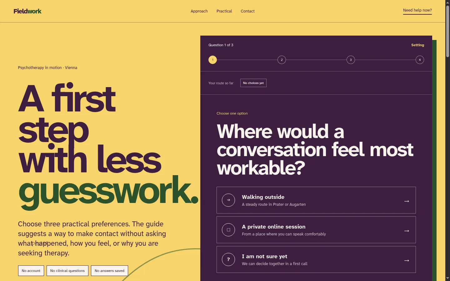
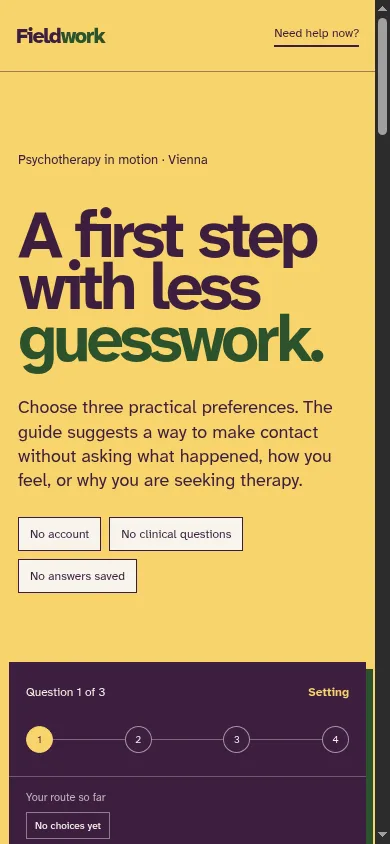
A fictional Vienna therapy-practice website showing how guided choices can reduce first-contact uncertainty without becoming a clinical questionnaire.
Why first contact is difficult
Contacting a therapist can require more effort than an ordinary service inquiry.
The visitor may be unsure what to write, whether the format fits, how much a session costs, whether the practice is available, or whether their message needs to explain everything at once.
A blank contact form can increase that uncertainty. A long intake questionnaire can create a different problem by asking for sensitive information before trust has been established.
Fieldwork Therapy was created to explore a middle path.
The website uses a short guided flow to help visitors choose a practical next step. It does not try to assess the visitor or determine what kind of treatment they need.
The route chooser
The guided flow appears in the opening viewport. Visitors do not have to scroll through the full website before discovering how to begin.
It asks three practical questions:
- Setting: Would walking outside, an online session, or an undecided format feel most workable?
- First step: Would a short call, practical information, or a first full session make starting easier?
- Timing: Is the visitor looking for a reply soon, planning ahead, or seeking immediate support?
Those questions are intentionally limited.
The flow does not ask:
- What happened.
- Why the person is seeking therapy.
- What symptoms they experience.
- Whether they have a diagnosis.
- What medication they use.
- Any free-text health or trauma information.
The choices remain in browser memory only. They disappear on refresh and are not placed in the URL or sent to analytics.
Making the interaction understandable
The redesigned chooser gives visitors several forms of orientation:
- “Question 1 of 3” progress text.
- A visible progress line.
- A plain label for the current topic.
- A trail showing previous choices.
- A back button.
- A start-over action.
- A shortcut to practical details.
- A clear statement that no answers are saved.
These details reduce the feeling of entering an unknown questionnaire.
Each option contains a practical title and a short explanation. The visitor sees what choosing it means before moving forward.
The result is a contact suggestion, not an assessment
Normal answers produce a suggested next step, such as:
- Request a twenty-minute call.
- Ask for the practical guide.
- Request a first session.
The result explains the suggested format, likely reply window, and the fact that the page saved nothing.
The prepared email includes only the selected practical preferences. The visitor can edit it before sending.
This distinction matters. The website is helping someone decide how to contact the practice. It is not deciding what care they need.
Immediate-support handling
When someone chooses immediate support, the page does not route them toward a normal practice inbox.
It clearly states that Fieldwork is not a crisis service and presents:
- European emergency number 112.
- TelefonSeelsorge 142.
- Vienna psychiatric emergency service 01 313 30.
Emergency information also remains visible in the footer, so it does not depend on completing the guided flow.
A real healthcare or therapy website should make crisis boundaries explicit without making every visitor feel alarmed. The information must be easy to reach and clearly separated from ordinary appointment contact.
Visual direction without wellness clichés
The concept avoids the common therapy-template combination of sage green, mountain photography, smiling stock portraits, and promises of transformation.
The visual system takes inspiration from Vienna public wayfinding and handwritten route notes:
- Pollen yellow creates warmth and visibility.
- Aubergine provides a calm high-contrast interaction surface.
- Leaf green marks direction and outdoor context.
- Route lines and numbered markers explain movement.
- Large, highly legible typography keeps the message direct.
Outdoor sessions are presented as one possible setting, not as a claim that nature itself is treatment.
Practical information builds trust
The page makes several common questions visible before contact:
- Introductory call length and price.
- Individual-session length and price.
- Outdoor and online availability.
- Languages.
- Weather and step-free route options.
- Cancellation terms.
This information reduces the number of uncertainties hidden behind the first email.
For sensitive professional services, clarity is a trust signal. Visitors should not have to decode the website to learn whether the service is financially or practically possible.
Accessibility considerations
The interaction uses ordinary buttons, meaningful headings, visible focus states, and a live result region.
Additional considerations include:
- Minimum touch-target sizes.
- No reliance on color alone.
- Focus movement when the question changes.
- Complete keyboard operation.
- High text contrast.
- Reduced-motion behavior.
- Essential crisis information outside the interactive flow.
The live concept passed automated accessibility testing with no detected violations, while recognizing that automated tools cannot replace manual testing with real users.
SEO considerations for therapy websites
This concept targets an informational UX question rather than competing directly with a named local-practice case study.
For a real practice, the search structure could include:
- Psychotherapy service and approach pages.
- Location and access information.
- Online-session information.
- Language availability.
- Fees and cancellation terms.
- Credentials and professional boundaries.
- Clear contact and emergency-information pages.
Local terms should be used naturally where they help people confirm fit. The content should avoid unsupported outcome claims, pressure, or language that implies guaranteed improvement.
What this concept demonstrates
Fieldwork demonstrates:
- Guided conversion design for a sensitive service.
- A privacy-conscious in-memory interaction.
- Clear progress and answer history.
- A prepared inquiry that contains no health information.
- A dedicated immediate-support branch.
- Accessible responsive controls.
- Practical information integrated into the sales journey.
It does not claim real patients, appointments, clinical outcomes, credentials, or practice availability.
How other service businesses can apply the approach
A guided first-contact flow can help whenever potential customers are unsure what they need.
Examples include:
- Interior designers helping visitors identify project type and timing.
- Salons helping visitors choose consultation or treatment categories.
- Accountants routing company, freelance, and tax questions.
- Real-estate businesses routing buyers, sellers, landlords, and tenants.
- Legal services helping visitors choose the correct consultation category without collecting confidential case details.
The questions should reduce uncertainty without asking for information the business does not yet need.
Plan a clearer professional-service website
If visitors hesitate because they do not know what to ask for, the website may need more than a contact form. A guided path, practical information, and clearer boundaries can make the next step easier without becoming aggressive.