Design Study
Winery Website Design With Cinematic Scroll
A fictional winery concept showing how cinematic scroll can create atmosphere without hiding the wines, production story, or tasting inquiry.
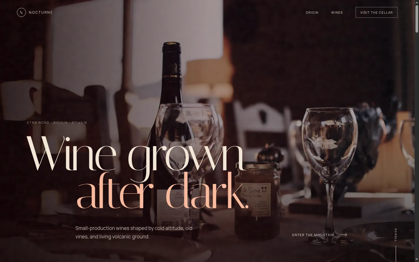
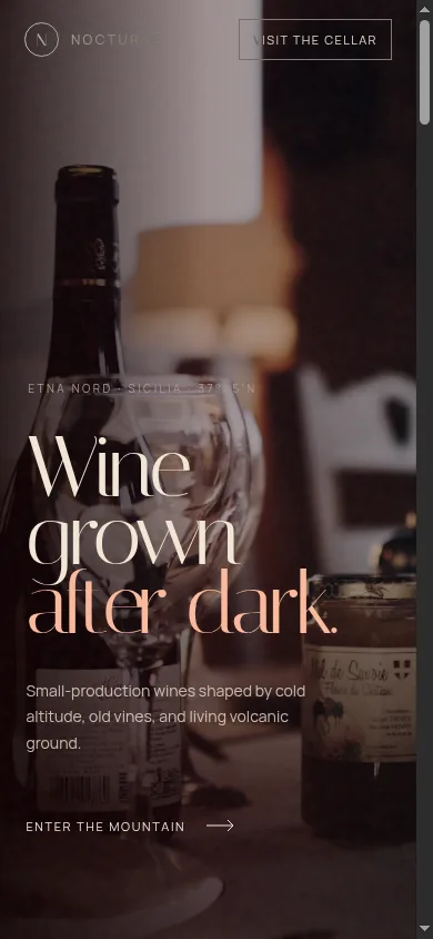
A fictional winery website concept exploring cinematic scroll, premium art direction, accessible motion, and a clear path to private tasting inquiries.
Before the concept
The starting problem was common to premium businesses with strong physical experiences: the real place feels memorable, but the website risks looking like every other company in the category.
Many winery websites rely on the same visual signals. They use dark burgundy backgrounds, gold typography, bottle grids, heritage language, and slow-motion pouring footage. Those choices can communicate wine, but they do not automatically communicate this wine, this landscape, or this reason to visit.
Nocturne needed a different structure. The fictional estate grows small-production wines on the north slope of Mount Etna. Its strongest material was not generic luxury. It was the tension between cold altitude, Mediterranean heat, black volcanic stone, old vines, and a quiet cellar.
The website therefore needed to answer two questions:
- How can the visitor feel the landscape before reading a long history page?
- How can the experience remain practical when someone wants to understand the wines or request a tasting?
The website strategy
The design uses cinematic scroll as a storytelling system rather than decoration. Each section advances one part of the estate story:
- The opening frame establishes atmosphere and location.
- The origin sequence moves through altitude, ground, vineyard work, and cellar conditions.
- The wine section presents three current releases without turning the page into an online shop.
- The practice section explains hand harvesting, native fermentation, old oak, and concrete.
- The final section turns the story into a clear private-tasting or allocation inquiry.
This pacing gives the page a film-like quality, but the underlying structure remains familiar. Visitors still receive a headline, supporting copy, product information, production details, and a visible next action.
Designing cinematic scroll without hiding the content
Scroll animation becomes a usability problem when it controls the visitor more than it helps them. A premium website should feel authored, but it should not force someone to wait for information or guess how to continue.
The Nocturne concept follows several rules:
One idea per visual beat
Each scroll state has a specific job. The site does not animate every heading, image, and line at once. One scene communicates altitude. Another communicates volcanic soil. Another communicates the cellar.
This makes the motion easier to follow and gives every transition a reason to exist.
Essential information stays in normal HTML
The estate story, wine names, tasting descriptions, production method, and inquiry text are not trapped inside a video or canvas. Search engines and assistive technologies can reach the same core information as a sighted visitor.
Mobile receives a different composition
A desktop sticky sequence does not automatically work on a small phone. On mobile, the scenes become a stacked narrative with readable copy and decisive images. The story remains intact without relying on a large viewport.
Reduced motion is a complete version
Visitors who prefer less motion receive the same content in a calmer format. Animation is removed without hiding sections or leaving the page in a half-transitioned state.
Visual direction
The art direction combines European film titles, volcanic material, and contemporary wine-label restraint.
The palette avoids pure black, pure white, and bright gold. Instead, it uses cellar brown, deep wine, ash, parchment, and a small amount of warm ember. Photography is treated as part of the narrative rather than a background behind generic marketing copy.
Typography creates contrast between the emotional and practical layers:
- A sharp display face carries the main statements.
- A highly legible sans serif handles navigation, body copy, wine details, and calls to action.
The result feels premium because the layout commits to a point of view, not because it adds more luxury symbols.
What the wine section needed to do
A visually ambitious winery website still has to help visitors understand the product.
The three fictional releases are presented as separate chapters rather than identical product cards. Each entry contains:
- Wine name and vintage.
- Grape or style context.
- A short sensory description.
- The role of altitude, soil, or cellar practice.
- A route toward tasting or allocation information.
This gives collectors, sommeliers, and curious travelers enough information to continue without turning the page into a technical database.
SEO considerations for a visually ambitious website
Cinematic design and SEO are not opposites. The problem appears when visual effects replace descriptive structure.
For a real winery project, the SEO-conscious version would include:
- A descriptive title explaining the estate, region, and wine category.
- One clear page heading.
- Text that names Mount Etna, the north-slope location, the grape varieties, and the tasting offer naturally.
- Individual pages for the estate, wines, visits, trade information, and journal content when enough material exists.
- Structured internal links between wine pages and the tasting page.
- Compressed image assets with useful alternative text.
- Local and regional information that helps visitors confirm where the estate is located.
The visual experience attracts attention. The content structure gives search engines and serious buyers something precise to understand.
What this concept demonstrates
Nocturne is proof of a specific capability: a website can feel atmospheric, cinematic, and premium without becoming a confusing showreel.
The concept demonstrates:
- Scroll-directed storytelling.
- Art direction for an image-conscious brand.
- Responsive cinematic layouts.
- Accessible reduced-motion handling.
- Product storytelling without a generic card grid.
- A clear transition from brand story to inquiry.
It does not claim real sales, bookings, rankings, or business results. The observable result is the live, responsive build itself.
How a premium local business can apply the same thinking
You do not need to own a winery to use this approach.
A restaurant could organize the story around ingredients, kitchen, service, and table. An interior designer could move from material references to finished spaces. A salon could move from consultation to treatment to final result. A real-estate business could turn location, architecture, and lifestyle into a paced visual argument.
The important question is not, “How can we add cinematic animation?”
It is, “What should the visitor understand and feel at each stage of the page?”
When the answer is clear, motion can support the story instead of competing with it.
Plan a distinctive business website
If your real-world brand feels more considered than your current website, start by defining the gap. The estimate workshop helps shape page count, visual depth, animation, SEO setup, inquiry flow, and launch support before committing to a final scope.