Design Study
Ceramic Studio Website Design With Scroll Animation
A fictional ceramic-lighting concept built around transparent product assets, material-led art direction, and one object traveling through the making story.
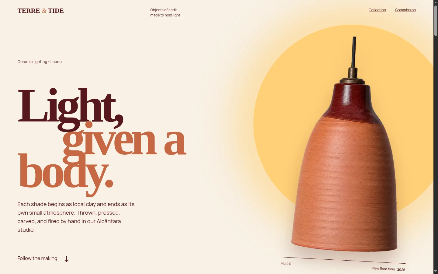
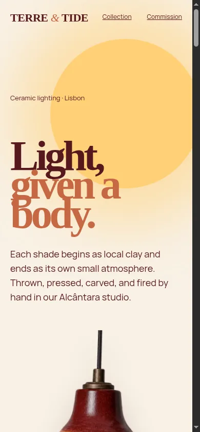
A fictional ceramic-lighting website using transparent product assets, material-led art direction, and one persistent object across the full making story.
The design problem
Ceramic studios, lighting makers, furniture brands, and interior-product businesses sell physical qualities that are difficult to communicate through generic layouts.
The customer cares about form, scale, texture, finish, light behavior, and how the object will feel inside a room. A standard grid of white-background product cards may show the collection, but it can flatten the material story.
Terre & Tide was created around a different idea: one ceramic pendant remains present while the visitor moves from raw earth to the finished room.
The website needed to accomplish four things:
- Make the material feel tactile.
- Explain the making process without becoming a long workshop essay.
- Present a small collection with useful product differences.
- Move naturally toward a residential or trade commission.
The object as the narrator
The Maré pendant acts as the visual thread through the page.
During the making story, the transparent product asset remains in a sticky stage while the surrounding sections change through four chapters:
- Earth: clay body, grog, surface, and hand pressure.
- Water: forming, settling, and visual proportion.
- Fire: firing temperature, iron wash, oxygen, and variation.
- Room: useful downward light and softer ambient glow.
The pendant translates, rotates, scales, and changes its surrounding glow as the visitor scrolls. The object is not redrawn as a simplified interface symbol. It remains a generated photorealistic cutout with visible clay and glaze texture.
This creates continuity. The visitor is not looking at four unrelated decorative sections. They are following the same object through its story.
Creating the product assets
The concept uses three original transparent product assets:
- Maré 01, a hand-thrown terracotta pendant with an oxblood collar.
- Duna 02, a cream dome table light on a terracotta base.
- Fenda 03, a faceted oxblood wall sconce with a bronze plate.
Each asset was generated as an isolated product photograph on a uniform chroma-key background. The background was removed locally, the edges were cleaned, and the objects were exported as high-resolution PNG and optimized WebP files.
That workflow gives the website several advantages:
- The products can sit on different color fields without a rectangular image background.
- The same object can be reused in the hero, collection, specifications, and commission sections.
- Drop shadows and glow can be controlled in CSS.
- The files remain small enough for responsive web use.
- The product imagery feels consistent across the page.
For a real studio, high-quality commissioned photography or accurate 3D rendering would normally replace concept imagery. The important principle is the same: flexible product assets create more art-direction options than fixed rectangular photographs.
Collection design without a generic card grid
The three products appear on a material shelf rather than inside rounded ecommerce cards.
Each item includes:
- Product name.
- Product type.
- Clay and glaze description.
- Transparent object image.
- A direct route to the commission section.
Hover states introduce the product color field and move the object slightly. The interaction supports material comparison without hiding the basic information.
On mobile, the shelf becomes a clear vertical sequence. Each product receives enough space to be understood without requiring hover.
Specifications are part of the design
Premium product websites sometimes make dimensions, lead times, and materials unnecessarily difficult to find. The page may look like a gallery but fail buyers who are trying to evaluate fit.
The Terre & Tide concept gives the featured pendant a dedicated specification section containing:
- Width and height.
- Material.
- Light-source format.
- Lead time.
- Starting price.
This is especially important for interior designers and architects. Emotional appeal gets attention. Accurate specifications help the project move forward.
Art direction
The color system is based on fired material rather than a generic luxury palette:
- Chalk.
- Terracotta.
- Deep glaze green.
- Oxblood wine.
- Warm lamp light.
Large fields of color divide the making chapters. The display typography has broad, hand-shaped forms, while the body copy uses a clear sans serif for specifications and practical details.
The page avoids coastal clichés, blue-and-white Portuguese motifs, and beige luxury styling. Lisbon is expressed through warmth, studio light, and material rather than decorative symbols.
SEO considerations for a studio website
A real ceramic or lighting studio can create useful search visibility through specific pages and content.
Potential topics include:
- Ceramic pendant lighting.
- Handmade wall lights.
- Custom lighting for restaurants and hotels.
- Lighting for interior designers and architects.
- Material and glaze guides.
- Installation specifications.
- Trade commissions.
- Lead times and custom dimensions.
- Studio process and care information.
Product names alone are rarely enough. Descriptive headings and copy should explain the product category, material, application, and location where relevant.
The visual story builds desire. The product and service language helps the right buyer find the page.
What this concept demonstrates
Terre & Tide demonstrates:
- Generated transparent product-asset creation.
- Scroll-linked movement using one persistent object.
- Material-led art direction.
- Responsive product presentation.
- Product specifications integrated into the visual system.
- Hover behavior that improves exploration.
- A direct residential and trade commission path.
The project does not claim real commissions, architect relationships, production output, or customer results.
How other premium businesses can apply the approach
The persistent-object idea works whenever one product, material, or transformation can carry the story.
A furniture maker could follow a chair from timber to finished room. A jeweler could follow one piece from sketch to stone setting. A restaurant could follow one ingredient from supplier to plate. A salon could follow the consultation, treatment, and maintenance process. A real-estate development could follow material, architecture, and daily use.
The key is continuity. One strong object can make a long page feel connected.
Plan a product-led website
If your products look distinctive in person but generic online, the website scope may need better product assets, stronger art direction, specifications, responsive interaction, and a clearer trade or inquiry path.